오늘은 디자인 퀄리티를 높여주는 카드 디자인의 그림자 구현 방법에 대해 알아보겠습니다. 과도한 그림자 효과는 앱을 버벅이게 할 수 있으니, 앱 내 콘텐츠가 많지 않은 경우에 사용하면 좋습니다. 직접 예제 코드를 작성해서 보여드리겠습니다.
Card 위젯의 이해
플러터 프레임워크가 매터리얼 디자인을 제공하기에 Card위젯으로 카드 디자인을 쉽게 구현할 수 있습니다. Card 위젯을 타고 들어가서 elevation과 shadowColor 프로퍼티가 어떤 위젯으로 변하는지 보겠습니다.
Semantics(
  container: semanticContainer,
  child: Container(
    margin: margin ?? cardTheme.margin ?? const EdgeInsets.all(4.0),
    child: Material(
      type: MaterialType.card,
      shadowColor: shadowColor ?? cardTheme.shadowColor ?? theme.shadowColor,
      color: color ?? cardTheme.color ?? theme.cardColor,
      elevation: elevation ?? cardTheme.elevation ?? _defaultElevation,
      shape: shape ?? cardTheme.shape ?? const RoundedRectangleBorder(
        borderRadius: BorderRadius.all(Radius.circular(4.0)),
      ),
      borderOnForeground: borderOnForeground,
      clipBehavior: clipBehavior ?? cardTheme.clipBehavior ?? Clip.none,
      child: Semantics(
        explicitChildNodes: !semanticContainer,
        child: child,
      ),
    ),
  ),
);
우선 Material이라는 위젯의 elevation, shadowColor 프로퍼티를 그대로 전달합니다. 빌드 메소드에서는 위젯이 3가지 타입에 따라 다른 위젯을 빌드하도록 되어 있습니다.
if (widget.type == MaterialType.canvas && widget.shape == null && widget.borderRadius == null) {
  return AnimatedPhysicalModel(
    curve: Curves.fastOutSlowIn,
    duration: widget.animationDuration,
    shape: BoxShape.rectangle,
    clipBehavior: widget.clipBehavior,
    elevation: widget.elevation,
    color: ElevationOverlay.applyOverlay(context, backgroundColor!, widget.elevation),
    shadowColor: widget.shadowColor ?? Theme.of(context).shadowColor,
    animateColor: false,
    child: contents,
  );
}

final ShapeBorder shape = _getShape();

if (widget.type == MaterialType.transparency) {
  return _transparentInterior(
    context: context,
    shape: shape,
    clipBehavior: widget.clipBehavior,
    contents: contents,
  );
}

return _MaterialInterior(
  curve: Curves.fastOutSlowIn,
  duration: widget.animationDuration,
  shape: shape,
  borderOnForeground: widget.borderOnForeground,
  clipBehavior: widget.clipBehavior,
  elevation: widget.elevation,
  color: backgroundColor!,
  shadowColor: widget.shadowColor ?? Theme.of(context).shadowColor,
  child: contents,
);
쉐입이 없지도 않고, 모서리가 사각형도 아니고, 위젯 타입이 투명하지도 않으니 가장 마지막 _MaterialInterior 위젯을 리턴하게 됩니다. 여기서도 동일하게 elevation과 shadowColor를 전달하네요.
PhysicalShape(
  clipper: ShapeBorderClipper(
    shape: shape,
    textDirection: Directionality.maybeOf(context),
  ),
  clipBehavior: widget.clipBehavior,
  elevation: elevation,
  color: ElevationOverlay.applyOverlay(context, widget.color, elevation),
  shadowColor: _shadowColor!.evaluate(animation)!,
  child: _ShapeBorderPaint(
    shape: shape,
    borderOnForeground: widget.borderOnForeground,
    child: widget.child,
  ),
);
이어서 PhysicalShape 위젯으로 elevation과 shadowColor를 전달합니다.
RenderPhysicalShape(
  clipper: clipper,
  clipBehavior: clipBehavior,
  elevation: elevation,
  color: color,
  shadowColor: shadowColor,
);
드디어 이 RenderPhysicalShape 위젯이 RenderBox의 서브클래스로서 void paint() 메소드를 통해 화면에 그리기를 합니다.
@override
void paint(PaintingContext context, Offset offset) {
  if (child != null) {
    _updateClip();
    final Rect offsetBounds = offset & size;
    final Path offsetPath = _clip!.shift(offset);
    bool paintShadows = true;
    assert(() {
      if (debugDisableShadows) {
        if (elevation > 0.0) {
          context.canvas.drawPath(
            offsetPath,
            Paint()
              ..color = shadowColor
              ..style = PaintingStyle.stroke
              ..strokeWidth = elevation * 2.0,
          );
        }
        paintShadows = false;
      }
      return true;
    }());
    layer ??= PhysicalModelLayer();
    layer!
      ..clipPath = offsetPath
      ..clipBehavior = clipBehavior
      ..elevation = paintShadows ? elevation : 0.0
      ..color = color
      ..shadowColor = shadowColor;
    context.pushLayer(layer!, super.paint, offset, childPaintBounds: offsetBounds);
    assert(() {
      layer!.debugCreator = debugCreator;
      return true;
    }());
  } else {
    layer = null;
  }
}
이렇게 카드 위젯의 그림자 하나를 표현하기 위해 많은 하위 노드들을 생성하게 됩니다. 그러면 Container에 BoxShadow를 추가하는 건 어떨까요? Container에 decoration 프로퍼티를 추가하면 SingleChildRenderObjectWidget의 서브클래스인 DecoratedBox 위젯이 createRenderObject 메소드를 통해 RenderDecoratedBox를 반환합니다. RenderObject의 서브클래스인 RenderDecoratedBox는 전달받은 컬러와 사이즈, 포지션을 체크해서 void paint() 메소드로 화면에 그리죠.
@override
void paint(PaintingContext context, Offset offset) {
  assert(size.width != null);
  assert(size.height != null);
  _painter ??= _decoration.createBoxPainter(markNeedsPaint);
  final ImageConfiguration filledConfiguration = configuration.copyWith(size: size);
  if (position == DecorationPosition.background) {
    int? debugSaveCount;
    assert(() {
      debugSaveCount = context.canvas.getSaveCount();
      return true;
    }());
    _painter!.paint(context.canvas, offset, filledConfiguration);
    assert(() {
      if (debugSaveCount != context.canvas.getSaveCount()) {
        throw FlutterError.fromParts(<DiagnosticsNode>[
          ErrorSummary('${_decoration.runtimeType} painter had mismatching save and restore calls.'),
          ErrorDescription(
            'Before painting the decoration, the canvas save count was $debugSaveCount. '
            'After painting it, the canvas save count was ${context.canvas.getSaveCount()}. '
            'Every call to save() or saveLayer() must be matched by a call to restore().',
          ),
          DiagnosticsProperty<Decoration>('The decoration was', decoration, style: DiagnosticsTreeStyle.errorProperty),
          DiagnosticsProperty<BoxPainter>('The painter was', _painter, style: DiagnosticsTreeStyle.errorProperty),
        ]);
      }
      return true;
    }());
    if (decoration.isComplex)
      context.setIsComplexHint();
  }
  super.paint(context, offset);
  if (position == DecorationPosition.foreground) {
    _painter!.paint(context.canvas, offset, filledConfiguration);
    if (decoration.isComplex)
      context.setIsComplexHint();
  }
}
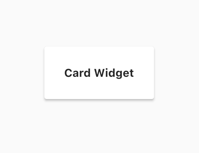
Card 위젯이 자식으로 Container 위젯을 가지고 있고, 두 가지 유형의 void paint() 메소드를 비교해 볼 때 BoxShadow를 가진 Container를 새로 만들어도 퍼포먼스면에서 큰 차이가 없어보입니다. (물론 그림자 효과 자체는 jank를 유발합니다.) Container위젯에 직접 BoxShadow를 추가한 StatelessWidget을 임의로 하나 만들어보겠습니다.
1. 그림자 중첩
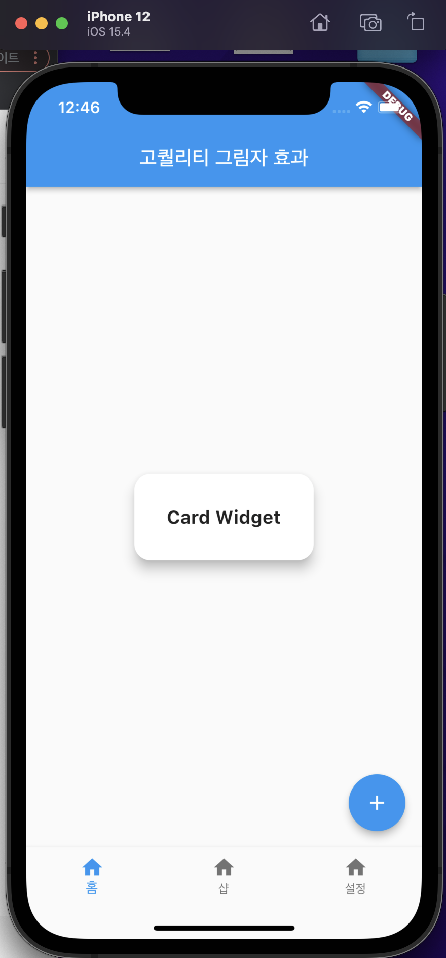
플러터에서 Card 위젯이 기본으로 제공하는 그림자는 너무 정직하게 생겼습니다. elevation 프로퍼티로 그림자 영역을 조절해서 그림자의 존재감을 강조할 수 있는데요. 별로 예쁘지는 않습니다. 아래는 elevation이 10인 Card위젯입니다.
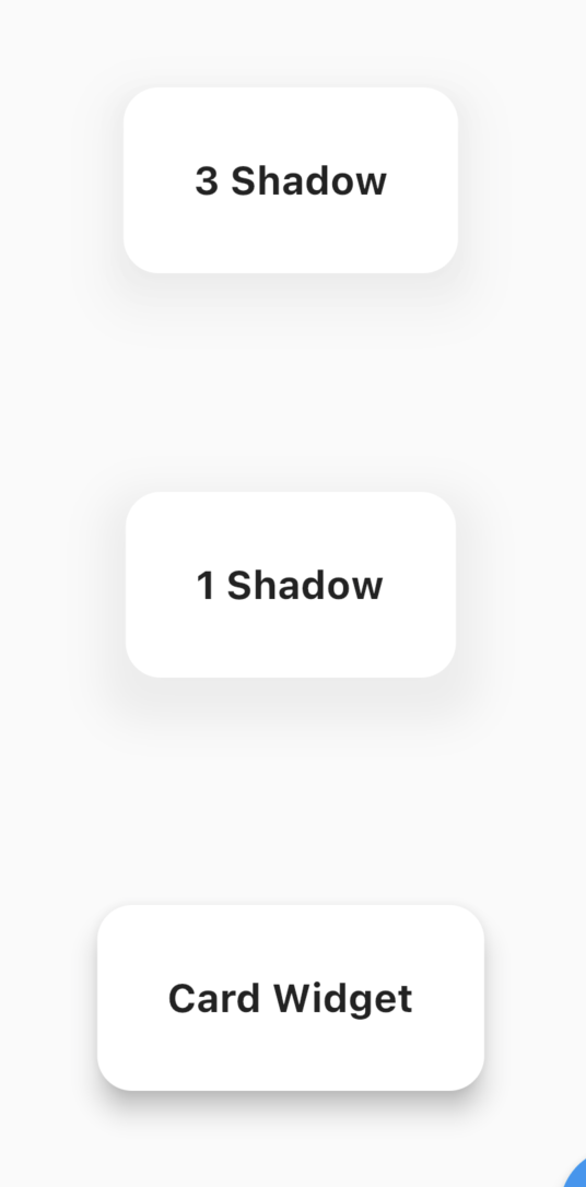
카드 위젯만 너무 둥둥 떠있는 느낌으로 이질감이 듭니다. 디자이너들은 하나의 그림자를 사용하지 말고, 여러개의 그림자를 중첩해서 사용할 것을 권유합니다. 점진적으로 커지는 그림자로, 가장 큰 그림자가 제일 진하고, 그 위에 점점 크기가 작아지고, 옅어지는 그림자를 중첩하는 거죠.
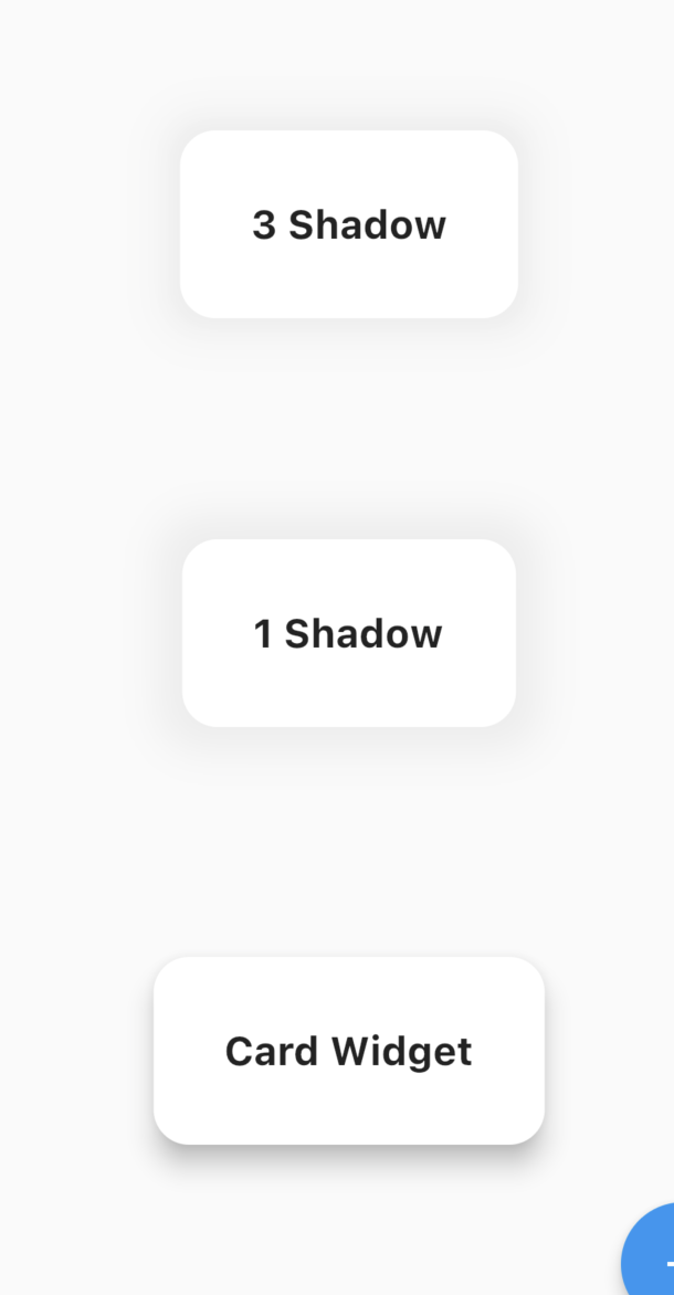
맨 위의 박스가 Container 위젯에 3개의 그림자를 중첩한 결과입니다. 중간 박스는 1개의 BoxShadow의 오퍼시티만 조절했습니다. 미세한 차이가 보이시나요? 맨 위에 있는 박스의 가장자리가 과하지 않게 경계가 생기는 모습을 볼 수 있습니다. 모던한 그림자는 투명도를 10~30%로 유지하라고 합니다. 중첩하는 오퍼시티의 합이 30을 넘지 않으면 되겠습니다.
2. 그림자 포지션 이동
그림자를 y축으로 이동시켜 위에서 빛을 비추는 것처럼 수정합니다. 더 입체적으로 보이는 효과를 줄 수 있습니다. Offset(0, y)을 조절해줍시다. 큰 영역의 그림자를 더 많이 움직여야 합니다.
그림자 포지션까지 이동하고 보니 예시의 차이가 확실히 보이네요.
3. 그림자 컬러 != 블랙
디자이너는 #000000 생 블랙을 사용하지 않습니다. 종이에 검은색을 프린트를 할 때에도 컨셉에 따라 검은색 위에 하나의 컬러를 덮습니다. 일반적으로 노란색을 검은색 위에 조금 추가하죠. 같은 이치로 그림자 컬러는 앱에서 볼 수 있는 옅은 컬러로 사용합니다. 플러터 기본 컬러가 블루 컬러이니, 옅은 파란색을 넣어보겠습니다.
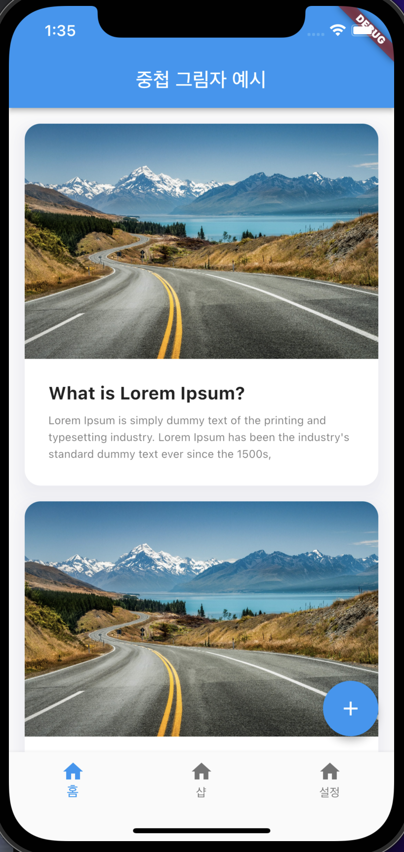
첫 번째 그림자를 중첩한 예시가 가장 모던한 디자인입니다. 여러분이 보시기엔 어떤가요? 임의의 내용을 넣어 카드 피드처럼 보여드릴게요.
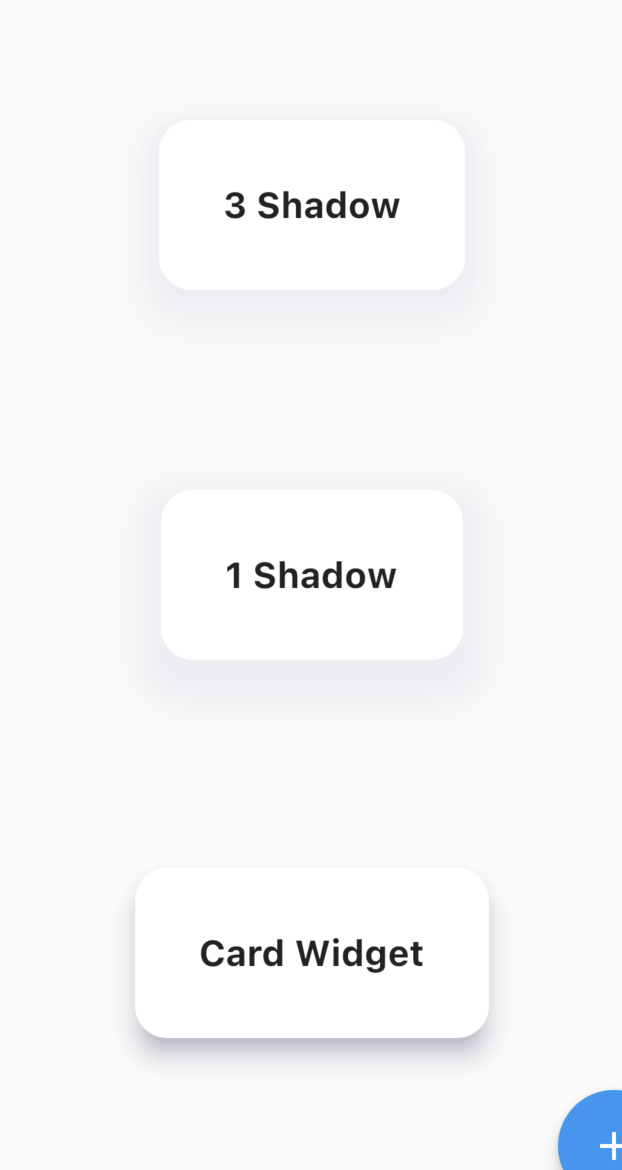
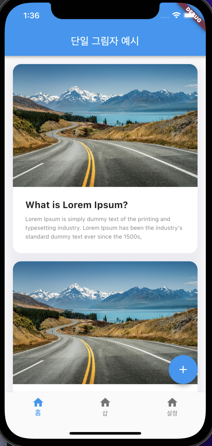
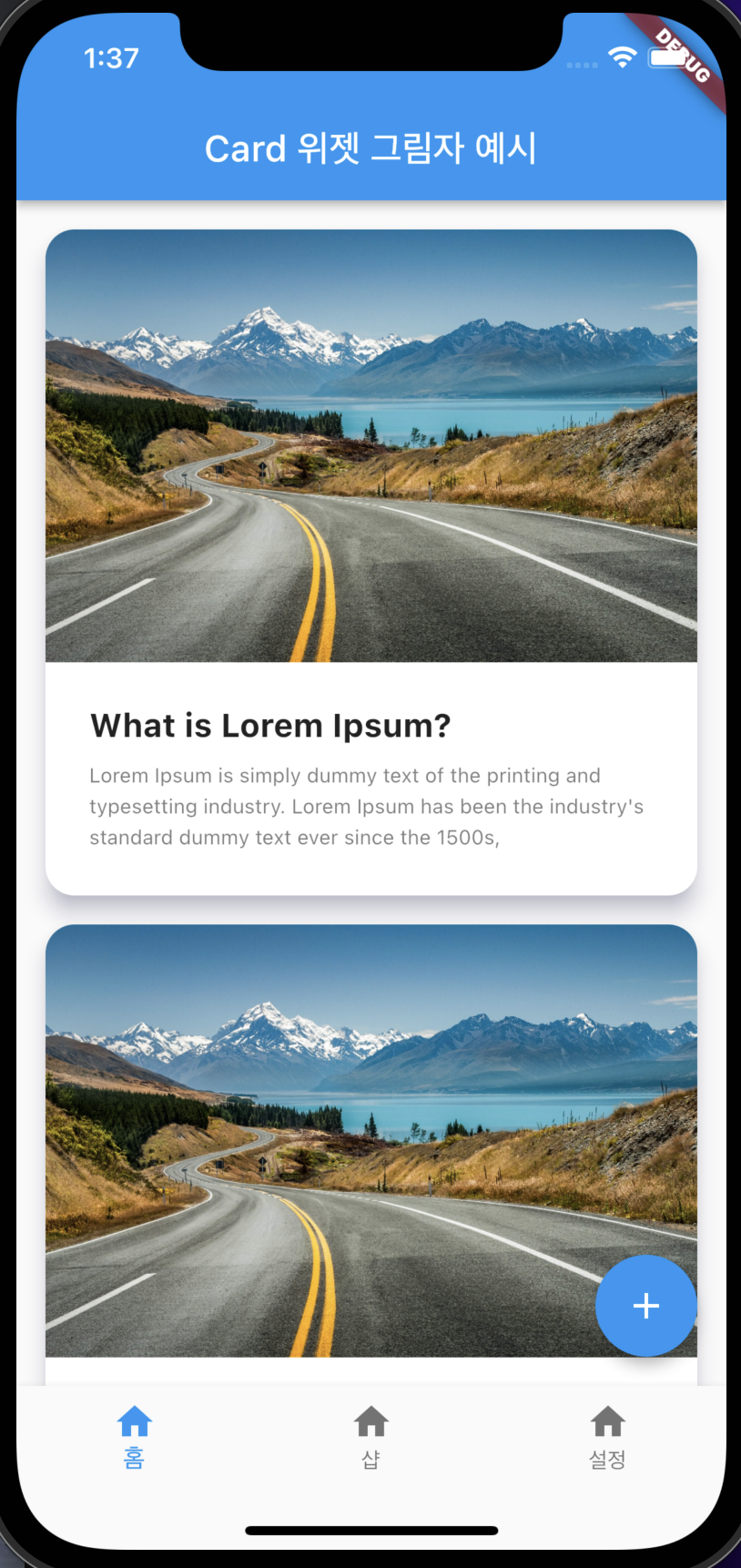
| 3개 중첩 그림자 사용 | 단일 그림자 사용 | Card 위젯 |
 |
 |
 |
아래는 첫 번째 그림자 중첩 예제 코드입니다.
Container(
  margin: const EdgeInsets.symmetric(horizontal: 16),
  decoration: BoxDecoration(
    color: Colors.white,
    shape: BoxShape.rectangle,
    borderRadius: BorderRadius.circular(16),
    boxShadow: [
      BoxShadow(
        color: Color(0XFF000066).withOpacity(0.03),
        blurRadius: 15,
        spreadRadius: 10,
        offset: const Offset(0, 10),
      ),
      BoxShadow(
        color: Color(0XFF000066).withOpacity(0.0165),
        blurRadius: 7.5,
        spreadRadius: 5,
        offset: const Offset(0, 5),
      ),
      BoxShadow(
        color: Color(0XFF000066).withOpacity(0.0095),
        blurRadius: 5,
        spreadRadius: 2.5,
        offset: const Offset(0, 2.5),
      ),
    ],
  ),
  child: Column(
    crossAxisAlignment: CrossAxisAlignment.start,
    children: [
      ClipRRect(
        borderRadius: const BorderRadius.only(
          topLeft: Radius.circular(16),
          topRight: Radius.circular(16),
        ),
        child: Image.network(
            'https://thelandscapephotoguy.com/wp-content/uploads/2019/01/landscape%20new%20zealand%20S-shape.jpg'),
      ),
      Padding(
        padding: const EdgeInsets.all(24),
        child: Column(
          crossAxisAlignment: CrossAxisAlignment.start,
          children: [
            const Text(
              "What is Lorem Ipsum?",
              style: TextStyle(
                fontSize: 18,
                fontWeight: FontWeight.bold,
              ),
            ),
            const SizedBox(height: 8),
            Text(
              "Lorem Ipsum is simply dummy text of the printing and typesetting industry. Lorem Ipsum has been the industry's standard dummy text ever since the 1500s, ",
              style: TextStyle(
                  fontSize: 18 / 1.618,
                  height: 1.5,
                  color: Colors.black.withOpacity(0.5)),
            ),
          ],
        ),
      )
    ],
  ),
),
플러터로 디자이너가 퀄리티 높게 보이기 위해 사용하는 그림자 만드는 법에 대해 알려드렸습니다. 그림자는 피드 콘텐츠 또는 버튼에 사용할 수 있어요. 위 3가지 예시를 보시고 여러분의 앱에 어떤 그림자를 사용하는 게 적합할지, 혹시 콘텐츠가 많아서 앱이 버벅이지는 않을지, 그렇다면 아예 그림자를 사용하지 않는 편이 좋을지는 여러분이 직접 판단하시길 바랍니다.
다음 강의에서는 구조화된 버튼 사용법에 대해 알아보겠습니다. 아래 링크를 눌러주세요!
'비전공자를 위한 Flutter > Flutter 심화과정' 카테고리의 다른 글
| Flutter 실시간 채팅앱 만들기 (feat. dart_amqp Docker RabbitMQ) (0) | 2022.05.20 |
|---|---|
| Flutter How to use each button 플러터 상황별 버튼 사용법 (0) | 2022.05.15 |
| Flutter How to use Key When, Where, Which key? 언제 어디에 무슨 키를 쓸까? (0) | 2022.05.09 |
| Flutter How to optimize? 속도 10배 상승시킨 앱 최적화 하는 법 공유 (0) | 2022.05.08 |
| Flutter State 생명주기? 코드 뜯어보기 (0) | 2022.05.07 |


댓글